Meshki
Stylish. Dark. Responsive.
Minimalist & Simple
Design your whole UI in absolutely no time. We have done our best to keep Meshki stupidly simple and clean, and provide you with starter templates.Eye-Friendly
Give your eyes some rest. Making use of a pleasant dark color, reading pages has never been this wonderful. It is especially important in web pages with plenty of textual content.Professional
Simplicity doesn't mean lack of features. Meshki was designed with creativity in mind, so your design can be totally different from this page.Rocket-Fast
By using less code and less complex logics, Meshki is light-weight and is not resource-hungry. Your browser doesn't have to render much.Zero Dependency
Meshki depends on absolutely nothing! It's all vanilla JavaScript and CSS. No JQuery and Tailwind means quick setup with no hassle.Stable
Meshki has been with you for more than 5 years now. Imagine the original stable project of Skeleton being maintained for another 8 years!What is Meshki?
Meshki is a simple, dark-colored, responsive css library to kickstart any web UI project. It is only ~20 KiB (minified) and ~30 KiB (normal), including both CSS and JS files, which makes it superb for small to medium projects. It's easy to use, clean and is just beautiful. It was started as a fork of Skeleton project, and it still uses the same logic. Though Meshki is considered to be a totally different project than Skeleton, and it barely resembles it when you take a look at it. Don't be afraid to check out Meshki's source code! If you've spotted any bugs, or you want to ask for some improvements, head to our GitHub repository and open an issue or a pull request!
Why Meshki?
There are tons of UI libraries out there in the wild, but what makes Meshki different?
Meshki tends to be light-weight, but useful. Contrary to most "light-weight" libraries, Meshki doesn't sacrifice usability for just being light-weight. This means that you don't need to reinvent the wheel, and many common components are ready for you to use out-of-the-box. I mean, everybody can create libraries less than 20 KiB, but does that actually make them useful?
Also, Meshki strives to bring you a clean eye-candy interface, the dark color doesn't hurt your eyes, and brings simplicity and elegance together. One of the main goals of Meshki is to be stable and reliable, so we try to provide you with regular updates and fixes as much as we can. Meshki is pretty stable right now.
Meshki and Skeleton have vast differences. Although Meshki is derived from Skeleton, it's far more complete than her parent. Just have a look at Skeleton's website. Most of the code there doesn't belong to original Skeleton and there are many custom CSS alongside the site. But this website is pure Meshki, and uses custom.css to customize website-related stuff.
Getting Started
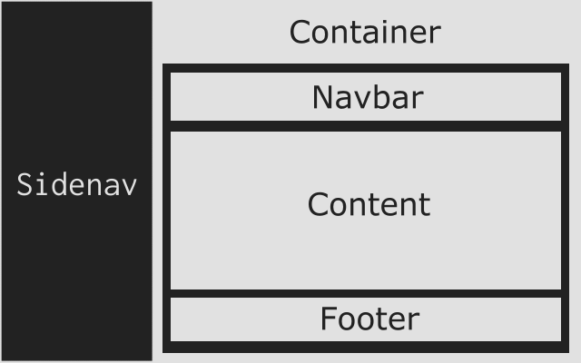
Meshki uses a fixed structure to lessen the burden of setting extra ids and classes. So you always need to create the same structure for all your apps. Don't worry, this structure is very basic and it does not limit you in any ways. You can check out the Boilerplate's source code to get started quickly.
First of all, you need to have a <div> with the sidenav class, just after the beginning of the body. Your sidenav's links will reside in here. Then, you need to create a <div> after the sidenav's div, with the container class. The rest of your body should be created inside the "container" div. Inspect the elements on this page to understand the structure. Ah! Here's a sample code:
<!DOCTYPE html>
<html>
  <head>
    <title>Meshki</title>
    <meta charset="UTF-8">
    <!-- Make the page Mobile-Friendly -->
    <meta name="viewport" content="width=device-width, initial-scale=1">

    <!-- Add OpenSans font -->
    <link href="https://fonts.googleapis.com/css?family=Open+Sans" rel="stylesheet">

    <!-- Add Meshki's files -->
    <link rel="stylesheet" type="text/css" href="dist/css/meshki.min.css">
    <script type="text/javascript" src="dist/js/meshki.min.js"></script>
  </head>
  <body>
    <div class="sidenav">
      <!-- Sidenav links here -->
    </div>

    <div class="container">
      <!-- This is your navbar -->
      <nav>
        <ul>
          <li><a class="logo" href="javascript:void(0)">My Website</a></li>
        </ul>
      </nav>

      <!-- The main content goes here -->
      <div class="content">
        <h3>Welcome to my cool website</h3>
        <p>This is a sample paragraph.</p>
      </div>

      <!-- And finally, your cool footer -->
      <footer>
        <div class="row">
          <div class="six col">
            <p>A text on the footer</p>
          </div>
        </div>
      </footer>
    </div>

  </body>
</html>
Of course, using Sidenav is optional, so are Navbar and Footer.
Components
Meshki has various ready-to-use components which you can create anywhere you like. Keep in mind that being small and "enough" are our main goals, and Meshki is not a full-fledged UI framework, therefore you may need to add extra libraries for other fancy stuff. However, most of the common components are ready to use and well-tested. But don't worry! We'll make sure that you always get the most stable UI and a beautiful experience, and we may add extra components from time to time.
Here are a list of components and how you can put them into use:
Buttons
You can create buttons easily with <a>, <button>, <input type="submit">, <input type="reset"> and <input type="button">. There are also five different types of buttons:
<a class="button small">Simple</a>
<button class="blue medium">Blue</button>
<input type="submit" class="green large" value="Green" />
<input type="reset" class="red medium" value="Red" />
<input type="button" class="orange small" value="Orange" />

<div class="button-couple">
  <button class="blue medium">Agree</button>
  <button class="medium disabled">or</button>
  <button class="red medium">Disagree</button>
</div>

<button class="expand large">Large Expanded Button</button>
Sidenav
Creating a sidenav is easy: Just create a <div> with the sidenav class after the opening body tag. Then add <a> tags to make sidenav links. It's pretty easy and straight-forward. Use the JavaScript functions of meshki.openSidenav() and meshki.closeSidenav() on events to open and close sidenav respectively. You can also add push class to make if even more fun! Here's an example for your convenience:
<body>
<div class="sidenav push">
<!-- Note that javascript:void(0) stops your page from jumping to the top -->
<a href="javascript:void(0)" class="sidenav-close-button" onclick="meshki.closeSidenav()">×</a>
<a href="">Home</a>
<a href="https://github.com/Borderliner/Meshki">GitHub</a>
<a href="https://github.com/Borderliner/Meshki/blob/master/CHANGELOG.md">News</a>
<a href="https://github.com/Borderliner/Meshki/blob/master/README.md">About Meshki</a>
<hr>
<a href="javascript:void(0)" disabled>Share on:</a>
</div>
Navbar
Meshki comes with a beautiful navbar built-in. At the beginning of the div.content, create a <div class="nav"> or a <nav>, and then create a <ul> inside that. Now any <li><a href="#">Link</a></li> inside the <ul> will appear as a button in the navbar. You can also add the fixed class to your nav to make the navbar fixed.
<nav class="fixed">
  <ul>
    <!-- Note that javascript:void(0) stops your page from jumping to the top -->
    <li><a class="logo" href="javascript:void(0)" onclick="meshki.openSidenav()">Meshki</a></li>
    <li><a href="https://github.com/Borderliner/Meshki/releases">News</a></li>
    <li><a href="https://github.com/Borderliner/Meshki">GitHub</a></li>

    <!-- Dropdown in Nav -->
    <li class="nav-dropdown">
      <a href="javascript:void(0)" class="nav-dropdown-button">Title</a>
      <div class="nav-dropdown-content">
        <a href="#">Sub 1</a>
        <a href="#">Sub 2</a>
        <a href="#">Sub 3</a>
      </div>
    </li>
  </ul>
</nav>
The Layout System
Grid Layout
The grid is a 12-col fluid grid with a max width of 960px, that shrinks with the browser/device at smaller sizes. The max width can be changed with one line of CSS and all col will resize accordingly. The syntax is simple and it makes coding responsive much easier. Go ahead, resize the browser.
Note: The col must be the first elements at the beginning of a row. This is very important.
Here's the code for how to use the grid system:
<div class="row">
  <div class="one col">
    A div with one col length
  </div>
  <div class="eleven col">
    A div with eleven col length
  </div>
</div>

<div class="row">
  <div class="one-third col">
    A div with one-third of the screen's length
  </div>
  <div class="two-thirds col">
    A div with two-thirds of the screen's length
  </div>
</div>

<div class="row">
  <div class="one-half col">
    A div with half of the screen's length
  </div>
  <div class="one-half col">
    A div with the other half of the screen's length
  </div>
</div>

<div class="row">
  <div class="six offset-by-two col">
    <!-- Pushes a six-width-element by two units >
  </div>
  <div class="two col">
    <!-- The rest of the screen >
  </div>
</div>
Flexbox Layout (New)
Flexbox is a one-dimensional layout method for arranging items in rows or columns. Items flex (expand) to fill additional space or shrink to fit into smaller spaces.
You can see all the helpers of a Flexbox.
<!-- Horizontal Flexbox -->
<div class="flexbox row">
  <div class="flex one">
    A div with one unit of flex expansion
  </div>
  <div class="flex three">
    A div with three unit of flex expansion
  </div>
</div>

<!-- Vertical Flexbox -->
<div class="flexbox col">
  <div>
    A vertical flex div
  </div>
  <div>
    The second vertical flex div
  </div>
</div>
General Helpers (New)
We've added basic general helpers for your convenience. Check them out here.
.block {
  display: block;
}
.invisible {
  visibility: hidden !important;
}
.relative {
  position: relative;
}
.fit {
  position: absolute;
  top: 0;
  right: 0;
  bottom: 0;
  left: 0;
}
.scroll {
  -webkit-overflow-scrolling: touch;
  overflow: auto;
}
Form Elements
Meshki also has customized form elements, which are just as beautiful as the others. Here are some examples of form elements you can use:
This is the code snippet on how you can use form elements:
<form>
  <!--Text Inputs -->
  <div class="row">
    <div class="six col">
      <label for="user1">Username:</label>
      <input id="user1" class="expand" type="text" name="user1" placeholder="Enter text here">
    </div>
    <div class="six col">
      <label for="pass1">Password:</label>
      <input id="pass1" class="expand" type="password" name="pass1">
    </div>
  </div>

  <!--Disabled Text Inputs -->
  <div class="row">
    <div class="twelve col">
      <label for="dis-email1">Email:</label>
      <input id="dis-email1" class="expand" type="email" name="dis-email1" value="me@borderliner.ir" disabled>
    </div>
  </div>

  <!--Text Area -->
  <div class="row">
    <div class="twelve col">
      <textarea class="expand">This is a sample <textarea> element.</textarea>
    </div>
  </div>

  <!--Dropdown -->
  <div class="row">
    <div class="six col">
      <select class="expand">
        <option selected disabled hidden>Choose your country</option>
        <option value="us">United Stated</option>
        <option value="ca">Canada</option>
        <option value="de">Germany</option>
        <option value="jp">Japan</option>
      </select>
    </div>
  </div>

  <!--Checkboxes and Radio Buttons -->
  <div class="row">
    <div class="six col">
      <input id="rad-male" type="radio" name="gender" value="male">
      <label for="rad-male" class="radio">Male</label>
      <input id="rad-female" type="radio" name="gender" value="female">
      <label for="rad-female" class="radio">Female</label>
      <input id="rad-other" type="radio" name="gender" value="other">
      <label for="rad-other" class="radio">Other</label>
    </div>
    <div class="six col">
      <input id="chk-eula" type="checkbox" name="chk-eula">
      <label for="chk-eula" class="checkbox">I've read and agree with Terms of Service.</label>
      <input id="chk-news" type="checkbox" name="chk-news">
      <label for="chk-news" class="checkbox">I wish to receive newsletters from this site.</label>
    </div>
  </div>

  <!-- Slider -->
  <div class="row">
    <input class="expand" type="range" name="percent" min="0" max="100" step="1" value="0">
  </div>

  <!-- Field Set -->
  <fieldset>
    <legend>Overview</legend>
    <span>First Name: Walter</span>
    <span>Last Name: White</span>
    <span>Age: 50</span>
    <span>Location: Albuquerque, New Mexico</span>
  </fieldset>
</form>
Typography
Type is all set with the rem, so font-sizes and special relationships can be responsively sized based on a single <html> font-size property. Out of the box, Meshki never changes the <html> font-size, but it's there in case you need it for your project. All measurements are still base on 10 though, so a <h1> with 5.0rem font-size just means 50px.
Heading <h1> 50rem
Heading <h2> 42rem
Heading <h3> 36rem
Heading <h4> 30rem
Heading <h5> 24rem
Heading <h6> 15rem
Code
Code styling is kept basic: just wrap anything in a <code> and it will appear like this. It also has a filled style. For blocks of code, wrap a <code> with a <pre>.
Note that for blocks of code, filled class needs to be added to the <pre>, not <code>.
Pay attention that Meshki doesn't contain syntax highlighting as you can see on this webpage. We use Prism for this website. Check it out!
<code>npm install meshki</code>

<pre>
  <code>
  .some-class {
    background-color: red;
  }
  </code>
</pre>
<code class="filled">npm install meshki</code>

<pre class="filled">
  <code>
  (function(
    console.log('Hello world!');
  ))();
  </code>
</pre>
Tables
Be sure to use properly formed table markup with <thead> and <tbody> when building a table.
You can customize your table with the below classes:
hoverable: Makes your table's rows highlighted when hovering over them with mouse.striped: It stripes your table (even rows, except the header).
| Name | Age | Sex | Location |
|---|---|---|---|
| Mohammadreza Hajianpour | 23 | Male | Iran |
| Carl Johnson | 48 | Male | Los Santos |
| Malena Morgan | 25 | Female | Florida |
| Harry Truman | 88 | Male | Missouri |
Footer
Meshki has a customized footer which is ready to use out-of-the-box. Create a <footer> element (or a div with "footer" class, since IE8 does not support <footer>).
Note that Meshki's footer does not enforce footer's height, so the more you add, the bigger it gets.
<footer>
  <div class="row">
    <div class="six col">
      <p>Created by: Mohammadreza Hajianpour (Borderliner)</p>
    </div>
    <div class="six col text-center">
      <p>2024, Licensed under Apache-2.0</p>
    </div>
  </div>
</footer>
Media Queries
Meshki uses media queries to serve its scalable grid, but also has a list of queries for convenience of styling your site across devices. The sizes for queries have been taken from Twitter's Bootstrap for more compatibility. The queries are mobile-first, meaning they target min-width. Mobile-first queries are how Meshki's grid is built and is the preferrable method of organizing CSS. It means all styles outside of a query apply to all devices, then larger devices are targeted for enhancement. This prevents small devices from having to parse tons of unused CSS. The sizes for the queries are:
- Desktop HD: 1200px
- Desktop: 992px
- Tablet: 768px
- Phablet: 544px
- Mobile: 400px
/* Mobile first queries */

/* Larger than mobile */
@media (min-width: 400px) {}

/* Larger than phablet */
@media (min-width: 544px) {}

/* Larger than tablet */
@media (min-width: 768px) {}

/* Larger than desktop */
@media (min-width: 992px) {}

/* Larger than Desktop HD */
@media (min-width: 1200px) {}
Utilities
Meshki has a number of small utility classes that act as easy-to-use helpers. Sometimes it's better to use a utility class than create a whole new class just to float an element.
/* Make element full width */
.expand {
  width: 100%;
  box-sizing: border-box;
}

/* Makes sure elements don't run outside containers (great for images in col) */
.responsive {
  max-width: 100%;
  box-sizing: border-box;
}

/* Float either direction (left|right) */
.float-left {
  float: left !important;
}

/* Center an element */
.centerize {
  margin-left: auto;
  margin-right: auto;
}

/* Align a text (left|center|right) */
.text-center {
  text-align: center;
}

/* Vertical line */
.vertical-line {
  border-left: 1px solid #E1E1E1;
}

/* Hides the element on mobiles and phablets */
@media (max-width: 544px) {
  .hide-on-mobile {
    display: none;
  }
}

/* Hides the element on tablets and smaller */
@media (max-width: 768px) {
  .hide-on-tablet {
    display: none;
  }
}

/* Hides the element on desktops */
@media (min-width: 768px) {
  .hide-on-desktop {
    display: none;
  }
}

/* Hides the element on non-mobile and non-phablets */
@media (min-width: 544px) {
  .hide-on-non-mobile {
    display: none;
  }
}
[Plugin] Extra Button Colors
Meshki v1.5.0 introduced more color options for you to choose. You only have to add the below line to the <head> part of your page.
<link rel="stylesheet" type="text/css" href="https://cdn.jsdelivr.net/npm/meshki@3.0.0/dist/plugins/meshki-extra-button-colors.min.css">
Here are a couple of buttons for you to try and use:
[Plugin] Light-mode
Since Meshki v3.0.0, you can take advantage of the light-mode in your designs. All you need to do is to add the following <link> tag and apply "light-mode" class to your <html> tag.
<link rel="stylesheet" type="text/css" href="https://cdn.jsdelivr.net/npm/meshki@3.0.0/dist/plugins/meshki-light-mode.min.css">
Important Notes
-
Meshki v3.x.x is a major release and has introduced some breaking changes, but the changes are 80% compatible with Meshki v2.x.x. Make sure you read the Changelog, so you can understand the latest important changes in Meshki.
-
Meshki v2.x.x is a major release and has introduced some breaking changes, which means that it's not backwards-compatible with previous versions. Make sure you read the Changelog, so you can understand the latest important changes in Meshki.
This webpage uses...
- The awesome font-awesome to display icons and such. It is by far the best font icon set I've ever encountered. Make sure to check out their website.
- The mighty Prism as a syntax highlighter. It's amazing!